
The digital world has significantly changed, and your website is usually the first impression of people on your brand. Although a good design can make a first impression, User Experience (UX) will make the difference whether visitors stay or not, whether they engage or not, whether they become customers or not.
Good UX practice is not an optional thing that people with sites should consider learning about; it is a necessity. An efficient, user-friendly, and pleasant experience of your visitors can significantly boost the interaction, reduce the rate of people abandoning your site, and eventually result in more purchases or registrations. So many companies even collaborate with Top User Experience (UX) Design Companies to ensure that their online presence can be tuned to the audience to perfection. This tutorial will take you through ten major UX tips to consider as you make your WordPress site a really user-friendly and efficient product.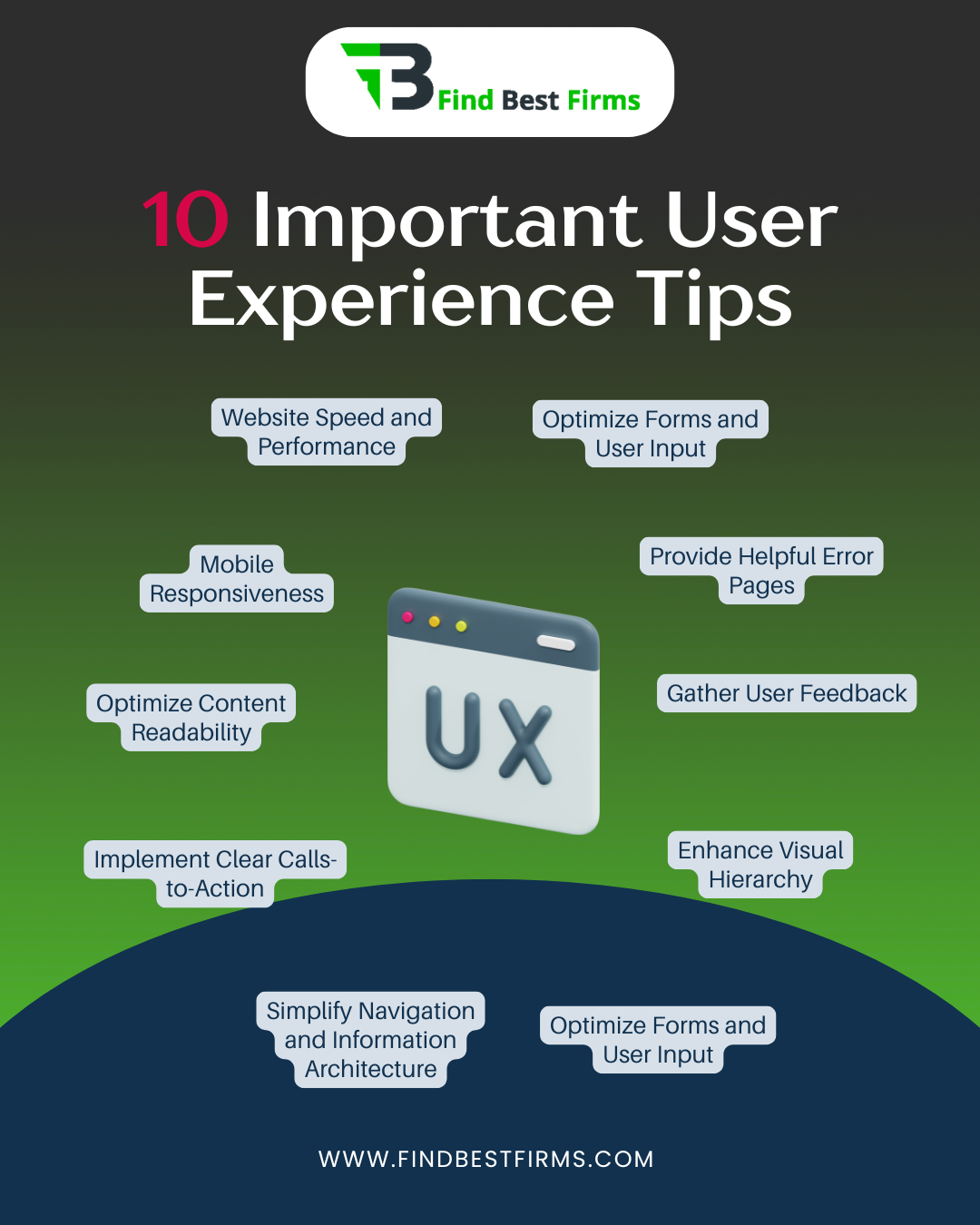
The 10 Important User Experience Tips
Tip 1: Prioritize Website Speed and Performance
Have you ever clicked on a link and then you just had to wait...and wait to see the page? Annoying, isn't it? The world is going digital, and everyone is too impatient in this era. Website speed is not merely a convenience as it is an essential element of a good UX, which determines the level of happiness that users feel, the optimization of the position of your site in search engines, and the frequency with which people perform the required actions. Research on this area constantly demonstrates that only one second of delay can lead to a huge decrease in pages per view and user satisfaction. Speed is also a critical element of good search engine optimization (SEO) in Google since Google likes fast loading sites.
First, to make your WordPress site incredibly fast, you have to optimize your images. Uncompressed images are very large and can be the greatest cause of slow loading. Compress images without sacrificing quality using tools, and use lazy loading, i.e. images are only loaded when a user scrolls to a place when they are needed. Then, select a decent hosting company with fast response of servers and the sufficient resources to provide traffic to the site. The other potent tool is called caching; to enable caching, you can use a plugin (WP Super Cache or LiteSpeed Cache) to generate basic, static copies of your pages, which are much quicker to load when visited again. Remember to minify your CSS, JavaScript and HTML, which is to cut out the fat characters to make files smaller. Last but not least, get smart with your WordPress theme and plugins. Select light and well-coded ones, and make sure to periodically review the list of installed plugins and deactivate or remove those you do not actually need.
Benefits of Applying This Tip:
- Improved User Satisfaction: Visitors stay longer and are more likely to return.
- Lower Bounce Rate: Fewer people leave your site immediately due to slow loading.
- Better Search Engine Rankings: Google favors faster websites, leading to more visibility.
- Increased Conversions: A quicker site means users are less likely to abandon forms or shopping carts.
- Enhanced Brand Perception: A fast site feels professional and reliable.
Tip 2: Ensure Mobile Responsiveness
With so many people using smartphones and tablets, it's no longer enough for your website to look good only on a desktop computer. A large majority of internet users now access websites on their mobile devices, making mobile responsiveness absolutely vital for a positive user experience. A website that doesn't adapt to mobile screens forces users to zoom in, pinch, and scroll too much, leading to frustration and a quick exit. Google's "mobile-first indexing" further highlights how important a mobile-friendly design is, as it primarily uses the mobile version of your content to decide how to rank your site.
The core of mobile responsiveness in WordPress is choosing a theme that is naturally responsive. Most modern themes are designed this way, smoothly adjusting to different screen sizes. However, simply having a responsive theme isn't enough; you must thoroughly test your website on various devices and screen sizes. Use browser developer tools or online responsive design checkers to see how your site looks on different phones and tablets. Pay close attention to "touch targets"—buttons and links should be large enough and spaced far enough apart for easy tapping on touchscreens. Make sure that text sizes are easy to read without needing to zoom, and that content flows naturally without requiring horizontal scrolling. A truly responsive design provides an equally excellent experience, no matter what device is being used.
Benefits of Applying This Tip:
- Wider Audience Reach: Your site is accessible and usable for everyone, regardless of their device.
- Improved User Engagement: Mobile users stay longer and interact more.
- Higher Search Rankings: Google prioritizes mobile-friendly sites.
- Consistent Brand Experience: Your brand looks good and functions well across all platforms.
- Increased Conversions on Mobile: Users are more likely to complete actions on a site that works well on their device.
Tip 3: Simplify Navigation and Information Architecture
Imagine walking into a huge library with no signs, no sections, and books scattered everywhere. Finding a specific book would be a nightmare. Your website's navigation and information architecture (IA) serve the same purpose as a library's organization system: to help users find what they're looking for quickly and easily. Confusing navigation is a major reason why users get frustrated and leave a website quickly. Users expect to understand your site's layout almost instantly.
To make navigation simpler, start with a clear, easy-to-understand menu structure. Use descriptive, short labels for your menu items, avoiding technical terms or jargon. Organize your content into logical categories and subcategories, making sure that related information is grouped together. "Breadcrumbs" are an excellent UX feature; they show users their current location within your site's structure and provide an easy way to go back to previous sections. Additionally, include a powerful search function, especially for websites with a lot of content. A well-placed and efficient search bar allows users to skip the menu system entirely and go straight to the information they need. Regularly check your site's analytics to see what users are searching for and where they might be getting lost, then improve your navigation based on these insights.
Benefits of Applying This Tip:
- Reduced User Frustration: Visitors can quickly find what they need.
- Increased Time on Site: Users explore more pages when navigation is clear.
- Higher Conversion Rates: A clear path to desired content or products leads to more completed actions.
- Improved SEO: Well-structured sites are easier for search engines to crawl and understand.
- Enhanced User Confidence: Users trust a site that is easy to navigate.
Tip 4: Optimize Content Readability
Even the most valuable content can be missed if it's hard to read. Readability is all about making your text easy to scan, understand, and absorb. When users land on your page, they often skim the content before they decide to read it fully. If your content appears as a solid block of text, they are likely to leave without taking in any information. Good readability keeps users engaged and ensures your message is effectively communicated.
To make your content more readable, start by using clear, straightforward language. Avoid overly complicated sentences and technical jargon unless your audience specifically needs it. Break up long paragraphs into shorter ones, ideally no more than three or four sentences. Use headings and subheadings (like H1, H2, H3) to structure your content logically and provide visual breaks. These also act as signposts, allowing users to quickly scan and find relevant sections. Bullet points and numbered lists are excellent for presenting information in an easy-to-digest format. Choose fonts that are easy on the eyes, and ensure enough space between lines of text (line-height) to prevent the text from looking cramped. Finally, always maintain good color contrast between your text and the background to prevent eye strain, especially for users with visual impairments.
Benefits of Applying This Tip:
- Increased Engagement: Users are more likely to read and understand your content.
- Improved Information Retention: Key messages are absorbed more effectively.
- Lower Bounce Rates: Users stay on pages longer when content is easy to consume.
- Enhanced Credibility: Well-presented content makes your site seem more professional.
- Better Accessibility: Easier for users with various reading abilities to process information.
Tip 5: Implement Clear Calls-to-Action (CTAs)
A website without clear calls-to-action (CTAs) is like a map without a destination. CTAs are vital elements that guide your users toward the next desired step, whether it's making a purchase, signing up for a newsletter, downloading an e-book, or contacting you. Without effective CTAs, users might not know what to do next, leading to missed opportunities and a less effective website.
To create clear CTAs, they must be prominently displayed and easy to spot. Use action-oriented and brief text that clearly tells the user what will happen when they click (e.g., "Download Now," "Learn More," "Get a Quote"). Use contrasting colors for your CTA buttons that stand out from the rest of your website's design, but still fit with your brand's look. The placement of your CTAs is equally important; put them strategically where they make the most sense in the user's journey. This could be at the top of a landing page, at the end of a blog post, or within the content itself where appropriate. Consider using empty space around your CTAs to make them pop and reduce visual clutter. Remember, a well-designed CTA removes any confusion and encourages users to take action.
Benefits of Applying This Tip:
- Increased Conversion Rates: Directly guides users to complete desired actions.
- Clear User Path: Users know exactly what to do next.
- Improved User Experience: Reduces guesswork and makes the site more intuitive.
- Better Business Outcomes: Leads to more sales, sign-ups, or inquiries.
- Enhanced Website Effectiveness: Every page serves a clearer purpose.
Tip 6: Enhance Visual Hierarchy
Visual hierarchy is the principle of arranging elements on a page to show their order of importance. It's about guiding the user's eye through your content in a specific way, making sure they notice the most critical information first. Without a clear visual hierarchy, your website can look messy and overwhelming, making it hard for users to process information and understand your message. A strong visual hierarchy creates a sense of order and professionalism.
To improve visual hierarchy, use size, color, and placement to highlight key information. Larger fonts, bolder text, and contrasting colors naturally draw attention. Place your most important elements (like headlines, CTAs, or key images) in prominent positions, often near the top or center of the screen. Ensure consistent branding and design elements throughout your site; this includes using the same fonts, colors, spacing, and button styles. Consistency builds trust and makes your site feel unified and professional. Effective use of white space (or negative space) is also crucial. White space isn't just empty space; it helps separate elements, reduces mental effort, and makes your content easier to scan and understand. It allows important elements to stand out and "breathe."
Benefits of Applying This Tip:
- Improved Information Processing: Users quickly grasp the most important content.
- Enhanced User Engagement: Guides users through the page effectively.
- Professional Appearance: Makes your website look organized and well-designed.
- Better Brand Recognition: Consistent design reinforces your brand identity.
- Reduced Cognitive Load: Users don't have to work hard to understand the page layout.
Tip 7: Optimize Forms and User Input
Forms are often a critical point of interaction on a website, whether for contact, registration, or making a purchase. A poorly designed form can be a major source of frustration, leading to many users giving up before completion. The goal is to make the process of submitting information as easy, quick, and smooth as possible for the user. Every unnecessary field or confusing instruction adds difficulty to the user experience.
To optimize forms, keep them short and ask only for necessary information. Each extra field increases the chance that someone will abandon the form. Provide clear labels for each field, and consider using placeholder text to give examples of the expected input. Offer clear instructions, especially for complex fields or password requirements. Implement "input validation" to check for errors as the user types, and provide helpful, specific error messages that tell the user exactly what went wrong and how to fix it (e.g., "Please enter a valid email address" instead of just "Error"). Use autofill where appropriate to automatically fill in known information, saving users time and effort. For longer forms, consider breaking them into multiple steps with a progress indicator to make the process feel less daunting.
Benefits of Applying This Tip:
- Higher Form Completion Rates: More users successfully submit forms.
- Reduced User Frustration: Makes the process of providing information easy.
- Improved Data Quality: Clear instructions lead to more accurate input.
- Faster User Journeys: Streamlined forms save users time.
- Enhanced Trust: A well-designed form feels secure and professional.
Tip 8: Provide Helpful Error Pages (404)
No one likes reaching a dead end, especially online. A 404 "Page Not Found" error can be a frustrating experience for users, potentially causing them to leave your site entirely. However, a well-designed 404 page can turn a negative experience into a helpful one, guiding users back to relevant content and maintaining a positive impression of your brand. It's an opportunity to show your website's personality and helpfulness.
Instead of a generic, unhelpful error message, create a custom 404 page for your WordPress site. This page should have a friendly, understanding message acknowledging the error (e.g., "Oops! It looks like this page can't be found."). Crucially, it should include practical elements to help the user. Always include a prominent search bar, allowing users to search for the content they were looking for. Provide links to your homepage, popular content, recent blog posts, or main categories. You might even include a link to your contact page. Make sure that your 404 page keeps your website's branding, including your logo, colors, and overall design, so users know they are still on your site. A helpful 404 page shows attention to detail and a commitment to user satisfaction.
Benefits of Applying This Tip:
- Improved User Retention: Users are guided back to your site instead of leaving.
- Enhanced Brand Image: Shows professionalism and a helpful attitude.
- Better SEO: Prevents users from hitting dead ends that could negatively impact crawlability.
- Reduced Frustration: Turns a negative experience into a positive interaction.
- Increased Engagement: Encourages users to explore other parts of your site.
Tip 9: Ensure Accessibility
Accessibility in web design means making your website usable by everyone, regardless of their abilities or disabilities. This includes people with visual impairments, hearing impairments, motor difficulties, and cognitive disabilities. Designing for accessibility isn't just about following rules; it's about being inclusive and reaching a wider audience. A truly great user experience is one that is available to all.
To ensure accessibility on your WordPress site, start by using "alt text" for all images. Alt text provides a written description of an image, which is vital for screen readers used by visually impaired users. Make sure that your website can be fully navigated using only a keyboard; this is crucial for users who cannot use a mouse. Test all interactive elements (buttons, links, forms) to ensure they can be reached and operated using the keyboard. Provide enough color contrast between text and background elements to make content readable for users with low vision or color blindness. Use proper "semantic HTML" (e.g., using h1 for main titles, nav for navigation) as this helps assistive technologies understand the structure and meaning of your content. Regularly review your site against Web Content Accessibility Guidelines (WCAG) to ensure compliance and provide an inclusive experience for everyone.
Benefits of Applying This Tip:
- Wider Audience Reach: Your site is usable by people with diverse needs.
- Improved SEO: Accessible sites are often better structured and easier for search engines to understand.
- Enhanced Brand Reputation: Demonstrates social responsibility and inclusivity.
- Legal Compliance: Helps meet accessibility standards and avoid potential legal issues.
- Better User Experience for All: Design choices for accessibility often benefit all users.
Tip 10: Gather User Feedback and Iterate
User experience is not a one-time setup; it's a continuous process of improvement. The best way to understand how users interact with your website and find areas for improvement is to collect their feedback and constantly refine your design. What works well today might not work tomorrow, and user behaviors change over time.
Start by using analytics tools like Google Analytics or Matomo to understand how users behave on your site. Track metrics such as how quickly people leave (bounce rate), how long they stay on a page, how often they complete desired actions (conversion rates), and how they move through your site. Beyond numbers, gather direct feedback from your users. Implement simple surveys on your site, create feedback forms, or even conduct user interviews if your resources allow. A/B testing is another powerful method: create two versions of a page or element (e.g., different CTA button colors) and test which one performs better. Based on the insights you gather from analytics and feedback, regularly review and update your website. This ongoing process of "test, learn, and improve" is fundamental to maintaining a high-quality user experience and ensuring your WordPress site remains effective and relevant.
Benefits of Applying This Tip:
- Continuous Improvement: Your website evolves to meet changing user needs.
- Data-Driven Decisions: Changes are based on actual user behavior, not assumptions.
- Increased User Loyalty: Users feel heard and valued when their feedback leads to improvements.
- Optimized Performance: Identifies and fixes pain points that hinder conversions.
- Competitive Advantage: Stay ahead by constantly refining your user experience.
Final Thoughts
Creating an outstanding user experience on your WordPress website is about more than just how it looks; it's about how it functions, how accessible it is, and how intuitively it guides users to what they need. By focusing on website speed, ensuring mobile responsiveness, simplifying navigation, making content easy to read, using clear calls-to-action, improving visual hierarchy, streamlining forms, providing helpful error pages, ensuring accessibility, and continuously gathering user feedback, you can transform your WordPress site into a powerful tool that delights your visitors and helps you achieve your business goals.
Remember, investing in good UX is an investment that yields significant returns in increased engagement, higher conversions, and stronger brand loyalty. Start putting these tips into practice today, and watch your WordPress website thrive.