A customer’s first interaction with your brand often happens through your website and it could be from anywhere. They might be scrolling on a phone while waiting for coffee, reading on a tablet during their commute, or comparing products on a smart TV at home. If your site doesn’t adapt seamlessly to these different devices and screen sizes, you risk losing that first impression and possibly the customer to a competitor who offers a smoother experience.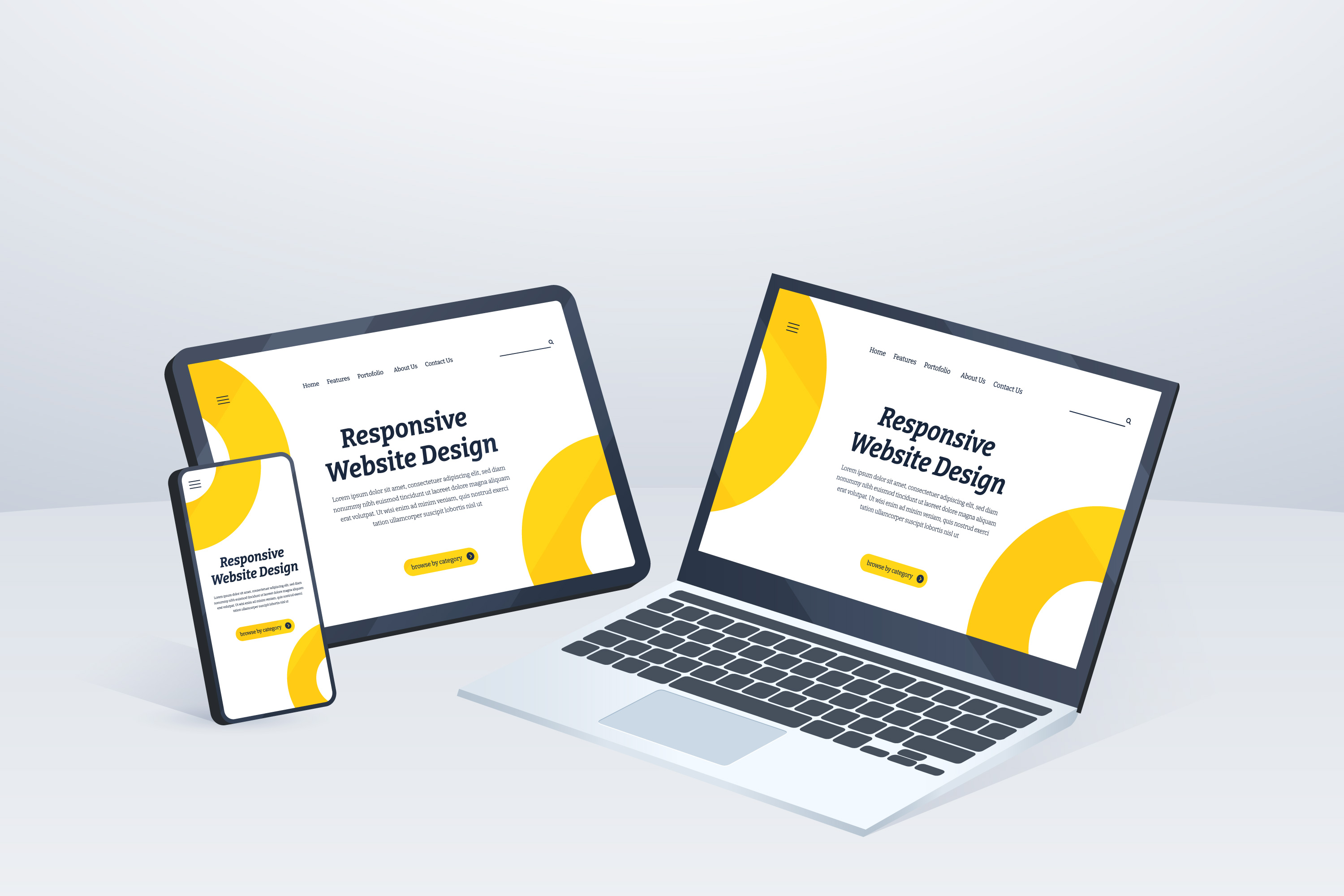
A fully responsive website is the key to delivering a consistent, high-quality experience on every device. It ensures your site not only looks great but also functions flawlessly, whether viewed on a smartphone, tablet, or desktop. For business owners, startups, and entrepreneurs, this is far more than a nice-to-have ; it's essential for driving growth, building credibility, and keeping customers engaged.
What Makes a Website “Fully Responsive”?
Mobile-friendly does not imply a fully responsive site. It is developed and created in a manner that enables it to automatically change its layout, images, text and functions depending on the size and resolution of the screen the device is being used.
Key traits of a fully responsive website include:
- Fluid grids: Flexible page structures that scale proportionally to different screens.
- Adaptive breakpoints: Adjustments at specific screen widths for optimal viewing.
- Responsive media: Images and videos resize without losing quality.
- Optimized navigation: Menus and buttons that remain functional and accessible on all devices.
- Touch-friendly elements: Ensuring usability for mobile and tablet users.
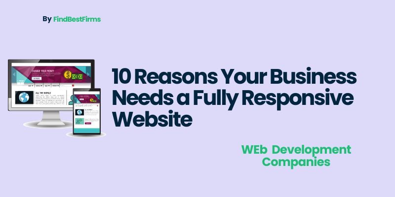
10 Reasons Your Business Needs a Responsive Website
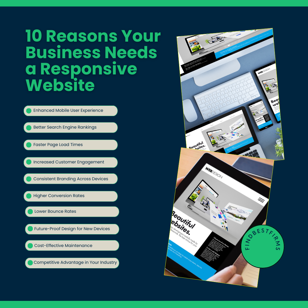
1. Enhanced Mobile User Experience
More than 58% of all web traffic now comes from mobile devices, and that number continues to grow. If your website isn’t mobile-friendly, you’re effectively turning away a large portion of potential customers.
A fully responsive website ensures your content, visuals, and navigation are just as engaging on a smartphone as they are on a desktop. It eliminates frustrating pinch-to-zoom, misplaced buttons, and broken layouts, replacing them with smooth scrolling, readable text, and intuitive touch interactions.
A positive mobile user experience builds trudevest and makes it easier for customers to stay, browse, and buy.
2. Better Search Engine Rankings (SEO Benefits)
Mobile-first indexing implies that the search engine will rank your site mostly based on the mobile version of your site. Your SEO may not be performing well because your site is not mobile friendly.
Responsive sites load quicker, cleaner code, bounce rates go down all things that Google will reward in search rankings. This implies that responsive design can be directly linked to the increased visibility of your business on the search results and help more individuals stumble across your business organically.
3. Faster Page Load Times
Speed is everything in an era when users demand that a web site load in 3 seconds or less. Responsive designs are normally constructed to be efficient in terms of performance; it uses optimized images, lean code, and mobile-first approaches to load content quicker.
It is not merely about convenience, speedier load times also directly influence conversion rates. Research indicates that a delay of 1 second in load time can lead to 7% decrease in conversions.
4. Increased Customer Engagement
Once people can easily navigate, read and interact with your site regardless of the device they are using- they will tend to spend more time and view more pages.
A responsive web design facilitates interactive websites with features such as image sliders, clickable CTAs, embedded videos, or forms, which can flawlessly work on any platform. This sustains the interests of the visitors and makes them taken further into your sales funnel.
5. Consistent Branding Across Devices
The brand should be identifiable in a large 27-inch computer screen and a small 5-inch smart phone display. A responsive version will make sure that your logos, colors, fonts, and visual style will be preserved in all devices.
Such uniformity does not only make your brand stronger, but it also builds trust. Customers are more comfortable transacting with an organization that appears professional and neat at all times.
6. Higher Conversion Rates
Ultimately, your website exists to drive action whether that’s making a purchase, booking a service, or signing up for a newsletter. A fully responsive website removes the friction that often prevents conversions on mobile devices.
Clear CTAs, simple navigation, and fast-loading product pages can make the difference between a bounce and a sale. With mobile commerce growing rapidly, having a responsive site is no longer optional for maximizing revenue.
7. Lower Bounce Rates
If a visitor lands on your site and finds it slow, hard to navigate, or visually broken on their device, they’ll leave immediately. This is your bounce rate and it’s a silent killer of online business performance.
A responsive website keeps users engaged by ensuring every page is visually appealing, easy to read, and functional. This means visitors are more likely to stay, explore, and eventually convert.
8. Future-Proof Design for New Devices
Technology is evolving at a breakneck pace. New devices, screen resolutions, and browsing technologies are constantly emerging. A fully responsive design isn’t just optimized for today’s devices it's adaptable to tomorrow’s as well.
By following best practices in Responsive Website Development, you create a foundation that automatically adjusts to new screen sizes without requiring a complete redesign. This adaptability saves both time and money in the long run.
9. Cost-Effective Maintenance
Without a responsive design, you might end up managing multiple versions of your site, one for desktop, one for mobile, and maybe even a separate app. This increases your workload, costs, and chances of inconsistencies.
A single responsive website means you only have one site to maintain, update, and optimize. This approach is far more cost-effective while ensuring your brand remains cohesive.
10. Competitive Advantage in Your Industry
Even in most industries you find businesses still having old non-responsive websites. Investing in a fully responsive design today puts you in a better position than those competitors.
A professional and credible site is one that appears modern and easy to use. Customers are more inclined to take a brand which is easy to connect to using any device and when they are connected to, they are less prone to the other brand.
The fully responsive site is not only the technical update, but also a business investment. It influences the way your clients view your brand and the ease with which they can engage with your content, and the effectiveness by which you can transform visitors into paying customers.
As a startup that has been working on its first site or an existing company that wants to update your digital presence, being responsive should become a priority since it will result in improved engagement, improved search rankings, and revenue.
If you’re ready to take your website to the next level, partnering with a trusted User Experience Design Company can help you create a responsive site that’s not only visually stunning but also highly functional. In today’s world, your website often serves as your first impression. Make sure it’s one that works beautifully on any device and leaves a lasting impact.