The first impression of your brand and a potential client in the modern digital world is often a web site. No matter your business size, whether you are a startup, an entrepreneur, or a small business owner, the manner in which you design your website may make it or break it online. Visual hierarchy is one of the numerous features of web design that helps direct the attention of the users, improve the usability of the web pages, as well as provide engagement.
What is Visual Hierarchy?

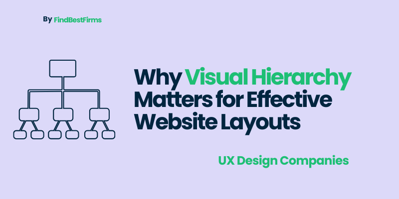
The visual hierarchy is the strategic placement of items on a webpage or a digital interface to convey the level of importance as well as focus the attention of the user. It dictates the sequence of information perceived, which visitors pay attention to the most. To ensure that the eye has a definite direction to take, designers make use of size, color, contrast, typography, spacing and positioning.
A good use of visual hierarchy will enhance readability, user experience and make sure that the significant actions, such as calls-to-action or product highlights, shine through. Working with experienced Web Design Experts can help businesses implement these principles effectively, increasing engagement, reducing confusion, and driving conversions. Through professional prowess, web sites will be able to create a smooth balancing between beauty and functionality to fit that each aspect of the site has its purpose and provides the highest effect.
Key Elements of Visual Hierarchy
Size and Scale: Larger elements naturally attract more attention. For instance, headings are typically larger than body text, signaling their importance.
Color and Contrast: Bright, bold, or contrasting colors can make elements stand out and draw the eye toward key areas like call-to-action buttons.
Typography: Font choice, weight, and style influence readability and visual appeal. Consistent typography helps create a cohesive design.
Spacing and Layout: Adequate spacing ensures that elements don’t feel cluttered and makes it easier for visitors to focus on specific content.
Positioning and Grouping: Strategically placing related elements together allows users to process information intuitively.
Understanding these elements helps designers create layouts that not only look good but also function effectively in guiding user behavior.
The Visual Hierarchy as a User Experience (UX) Element
The hierarchy of a visual component is a crucial part of the entire user experience (UX) of a web site, it has a direct impact on how people engage with your material and whether they become loyal customers or not. An intelligently structured hierarchy will see to it that your users will not have the trouble browsing your site, they can locate what they want within a short time, and they will be able to connect with what you are offering them.
Guiding User Navigation
Once a user accesses a web site, it is hardly possible to read all the words on the websites but rather they scan pages to find information that is relevant to them. A powerful visual hierarchy helps them to focus on the most critical things first, i.e., product features, special offers, or call-to-action (CTA) buttons. To use an example, the landing page of a startup that includes a clear and bold headline, a CTA in second place, and or minimal supporting information can inherently direct traffic to sign up, explore services, or buy. With tactical prioritization of essential factors, visual hierarchy builds a smooth flow that is intuitive and meaningful.
Minimizing the Cognitive Overload
Sites with too many conflicting images or crowded information are likely to overpower the listener or visitor leading to frustration and increased bounce rates. Visual hierarchy helps to overcome this and prioritize the content based on its significance and helps the user process information in smaller manageable pieces. By focusing on the essential elements, it is possible to make sure that visitors can make the necessary decisions in a short amount of time, improving the overall usability and satisfaction.
Enhancing Readability
Attractive visual hierarchy is a great contributor to legibility. Designers simplify the content scanning and comprehension process by using plain headings, sub headings, points, and contrasting text colors. Such logical organization does not only make it easier to understand it but it also makes visitors want to spend more time, immerse themselves and eventually take action they would like to.
Effect on User Interaction and Conversion
An effective site will be much more than a beautiful one; it will be used as a strategic device to attract users, sell value, and elicit conversions. Visual hierarchy is a determining factor of the quality of interaction between visitors and a website, as it affects their initial perception to the last action. The sequencing of visuals in corporations can direct users by their significance in a subtle way, thus improving the overall performance of websites.
Highlighting Key Actions
Each site is crafted with an ambition be it the stimulation of enrollments, buying, or requests. High visual hierarchy guarantees the visibility of the buttons, forms and call-to-action (CTA) items using effective color, contrast, and size application. On the one hand, these elements can be visually differentiated and spaced intuitively, which allows users to identify the next action to perform right away, leading to increased engagement and conversion rates, on the other hand.
When it comes to purchasing choices, a manager must act as a persuasive force that negotiates through anticipating customer needs, customer desires, and the organization's necessary principles.
Influencing Purchase Decisions
When it comes to purchase decisions, a manager should be a persuasion force that negotiates based on the ability to anticipate customer needs, customer wants and the principles that should be adopted by the organization.
In the case of eCommerce websites, the hierarchy of design has a direct influence on sales. Ease of comparing and making decisions comes as a result of clear presentation of product images, pricing and description to users. Studies are always determined that in cases where the necessary information is highlighted, the user becomes more comfortable moving to the checkout.
Improving Retention
An equal visual flow promotes clarity, less thinking, and makes sure that the visitor is not overwhelmed. Websites can keep visitors interested, explore more, and have the desire to keep coming back by providing a smooth, visually instructive experience; which are crucial to the success of the long-term web.
Principles for Implementing Visual Hierarchy in Layouts
Creating an effective visual hierarchy requires the perfect balance of creativity, psychological insight, and strategic execution. It’s not just about designing something visually appealing—it’s about structuring information in a way that naturally guides users’ attention and enhances their overall experience. Below are key principles to help implement a strong visual hierarchy within your website layout:
Use Size and Scale Strategically
The human eye is instinctively drawn to larger elements first. By adjusting the size and scale of design components, you can emphasize what truly matters. Headlines, banners, and featured products should be visually dominant, while supporting details like captions or secondary information can appear smaller. This intentional contrast creates a logical visual path, allowing users to process information effortlessly.
Apply Color and Contrast Thoughtfully
Color and contrast are among the most powerful tools in web design. Vibrant hues and contrasting tones can draw attention to essential areas such as call-to-action buttons, special offers, or product highlights. However, restraint is key too many bold colors can distract or overwhelm visitors. A well-balanced palette reinforces focus and visual clarity.
Maintain Consistent Typography
Typography establishes rhythm and hierarchy within your content. Select a font family that reflects your brand identity and apply consistent styles across headings, subheadings, and paragraphs. Varying font sizes and weights helps users distinguish primary information from supporting text while maintaining an organized, professional look.
Optimize Spacing and Layout
Whitespace often underestimated plays a vital role in visual hierarchy. Adequate spacing between elements prevents visual clutter and allows each section to stand out. Thoughtful use of margins and padding improves readability, directs the user’s eye flow, and enhances the overall aesthetic of the design.
Group Related Elements Intuitively
Grouping related information, such as product features, testimonials, or services, allows users to interpret content faster and with greater ease. Logical grouping also improves visual scanning, helping visitors make sense of the page structure without unnecessary effort.
When these principles are harmoniously applied, your website achieves a seamless visual flow that guides visitors toward key information and desired actions. A well-executed visual hierarchy not only elevates the user experience but also strengthens brand communication and overall site performance.
Tools and Resources to Enhance Visual Hierarchy
Creating a strong visual hierarchy requires not only design knowledge but also the right set of tools to bring concepts to life and refine user interactions. From design software to analytics platforms, several resources can help you build, test, and improve hierarchy across your website.
Design Tools
Leading design platforms such as Figma, Adobe XD, and Sketch empower designers to create detailed wireframes, mockups, and layouts that establish a clear visual hierarchy. These tools allow teams to experiment with size, color, typography, and spacing key elements that shape how users perceive and navigate a page. Their collaborative features also make it easy for designers, developers, and stakeholders to work together in real time.
UX/UI Testing Tools
Once a design is in place, tools like Hotjar and Crazy Egg help analyze real user behavior through heatmaps, session recordings, and click tracking. This data-driven insight reveals how users interact with your site, pinpointing areas where visual hierarchy may need adjustments to improve engagement and conversions.
Design Inspiration Platforms
Websites like Behance and Dribbble provide excellent examples of strong visual hierarchy in action. They serve as valuable sources of inspiration for startups and designers aiming to create aesthetically pleasing yet functional layouts.
Final Thoughts
Visual hierarchy is more than a design trend; it’s a critical strategy that shapes how users navigate and interact with your website. By organizing content effectively, it enhances usability, boosts engagement, and drives conversions. Investing in a thoughtfully designed website, whether in-house or through expert Web Developers and Web Design Companies, ensures your site looks professional while performing efficiently. In today’s competitive digital landscape, mastering visual hierarchy is essential for creating websites that capture attention, guide visitors seamlessly, and support long-term business growth. Clear hierarchy transforms a website into a powerful tool for user experience and success.